Bilješka
Pristup ovoj stranici zahtijeva provjeru vjerodostojnosti. Možete pokušati da se prijavite ili promijenite direktorije.
Pristup ovoj stranici zahtijeva provjeru vjerodostojnosti. Možete pokušati promijeniti direktorije.
The job diagram in the Azure portal helps you visualize a Stream Analytics job's query steps (logical concept) or streaming nodes (physical concept), along with its input source, output destination, and metrics. The job diagram lets you examine the metrics for each step or streaming node so that you can identify the source of a problem when you troubleshoot issues.
This article describes the logical and physical diagram views and the metrics available in each, so you can choose the right view to troubleshoot and optimize your streaming jobs.
Important
This feature is currently in preview. See the Supplemental Terms of Use for Microsoft Azure Previews for legal terms that apply to Azure features that are in beta, preview, or otherwise not yet released into general availability.
Types of job diagrams
Stream Analytics provides two types of job diagrams:
Physical diagram: Visualizes the key metrics of a Stream Analytics job by using the physical computation concept, the streaming node dimension. A streaming node represents a set of compute resources that process a job's input data. For more information about the streaming node dimension, see Azure Stream Analytics node name dimension.
Inside each streaming node, Stream Analytics processors are available to process the stream data. Each processor represents one or more steps in your query. To visualize the processor topology in each streaming node, use the processor diagram in the physical job diagram.
Logical diagram: Visualizes the key metrics of a Stream Analytics job by using the logical concept, the query step based on the job's queries.
Access the job diagram
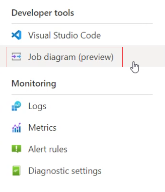
The job diagram is available in the Azure portal for each Stream Analytics job, under Developer tools > Job diagram (preview).
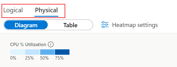
The top-left corner of the diagram provides a switcher between the two job diagram types, Logical and Physical.
Physical job diagram
The following screenshot shows a physical job diagram with a default time period (last 30 minutes).
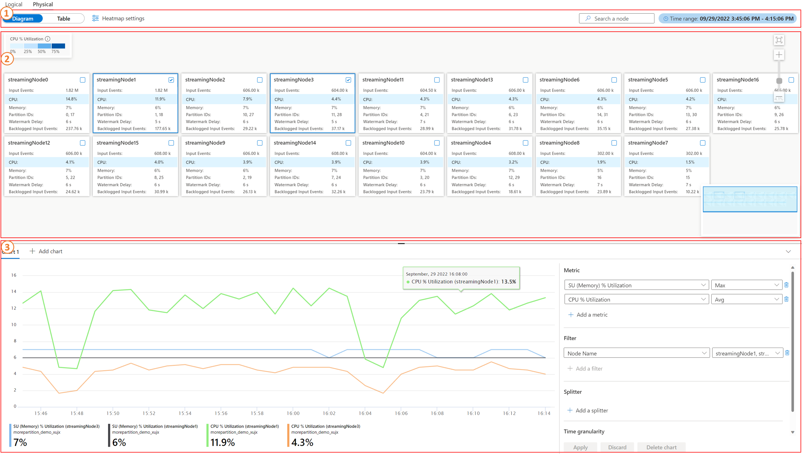
A physical job diagram has three main sections: a command bar section, a diagram/table section, and a chart section.
Command bar section
The command bar section is the command area for configuring the time range of the job metrics, switching or configuring heatmap visualization, searching for a streaming node, and switching the view between Diagram and Table. The following screenshot shows the table view:
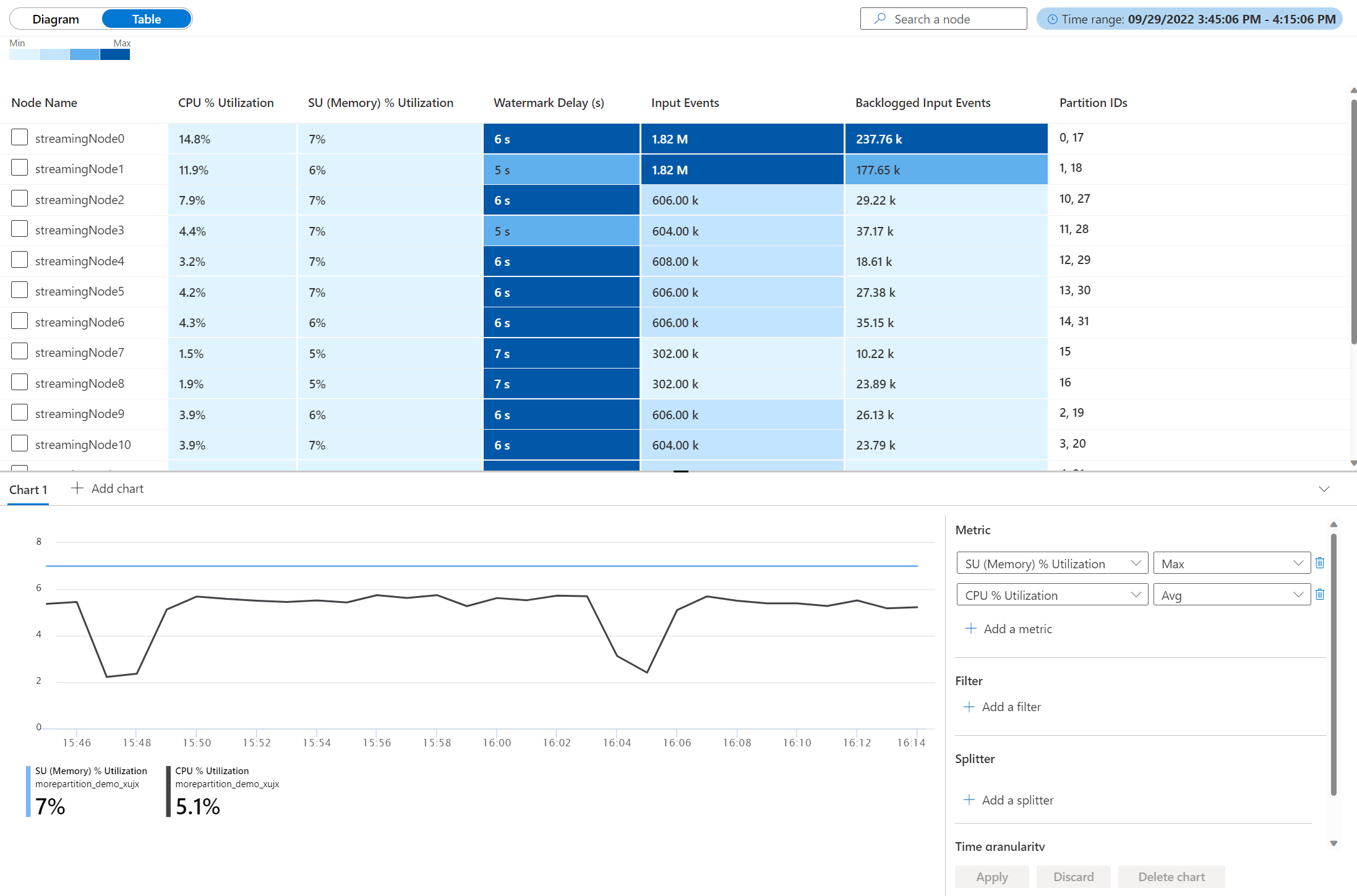
The command bar provides the following options:
- Heatmap settings: The heatmap setting sorts the nodes in the diagram based on the selected metrics and sorting type. The metrics can be CPU or memory utilization, watermark delay, input event, and backlogged input events.
- Time range: The time range and job run determine which diagram and metrics appear.
- Job run: Job run is inside Time range. When you start, restart, or scale a job up or down (streaming unit (SU) changes), Stream Analytics generates a new job run. One job run maps to one physical job diagram.
- Diagram/Table view switcher: The switcher changes the view between diagram and table.
Diagram and table section
The diagram and table section shows the metrics aggregated within the selected time range at the streaming node level in either diagram view or table view. Each box in this section represents a streaming node that processes the input data. For more information about the metrics definition, see Azure Stream Analytics node name dimension. The metrics on each node are:
- Input Events (Aggregation type: SUM)
- CPU % Utilization (Aggregation type: Avg)
- SU (Memory) % Utilization (Aggregation type: Max)
- Partition IDs (A list, no aggregation)
- Watermark Delay (Aggregation type: Max)
- Backlogged Input Events (Aggregation type: SUM)
Chart section
The chart section shows the historical metrics data within the selected time range. The default metrics shown in the default chart are SU (Memory) % Utilization and CPU % Utilization. Additional charts are available through Add chart.
The Diagram/Table section and Chart section interact with each other. Selecting multiple nodes in the Diagram/Table section filters the metrics in the Chart section by the selected nodes, and vice versa.
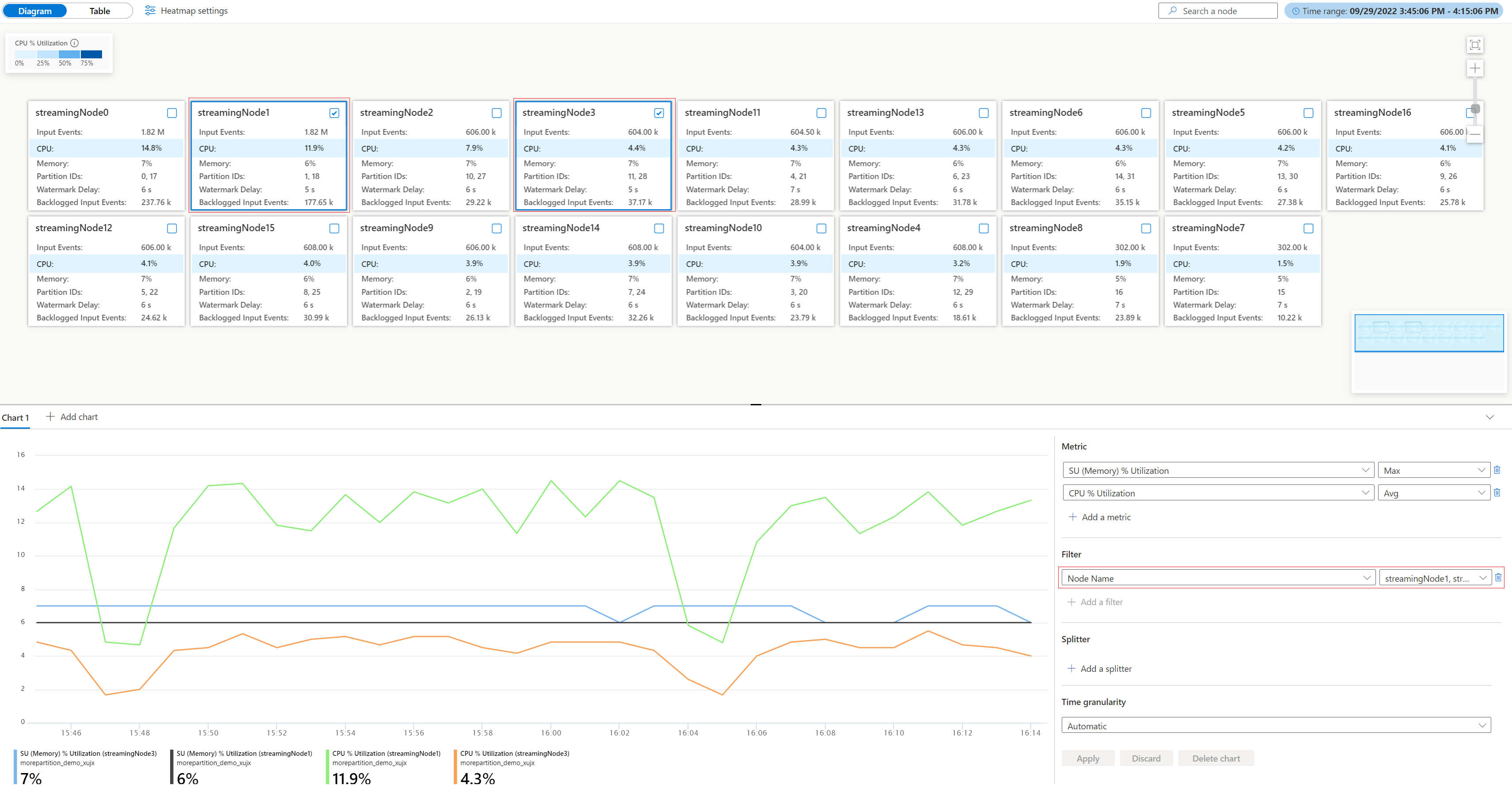
To learn more about how to debug with the physical diagram, see Debugging with the physical job diagram (preview) in Azure portal.
Processor diagram in physical job diagram
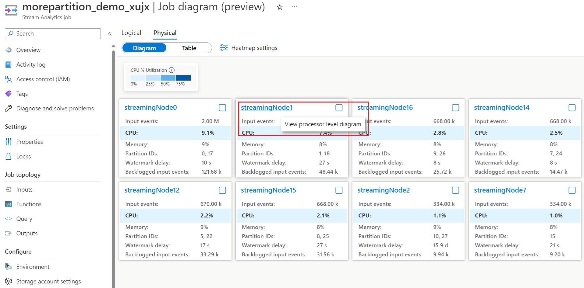
The processor diagram in the physical job diagram visualizes the processor topology inside a specific streaming node. You can access the processor diagram from the physical job diagram by selecting the name of the streaming node whose processor topology you want to examine.
After you open the processor diagram, it shows the processors that run inside the selected streaming node.
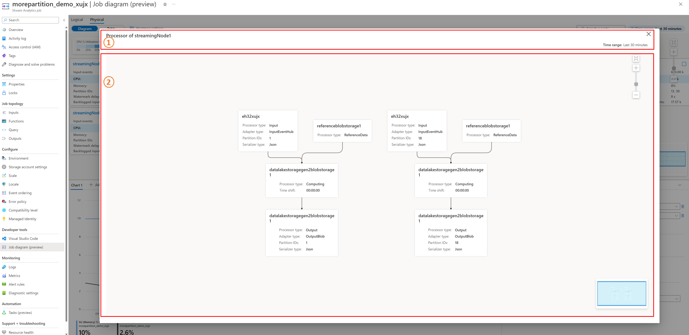
The processor diagram has two sections: an information bar section and a diagram section.
Information bar section
The information bar section shows the basic information for this processor diagram, such as the time range and the corresponding streaming node name.
Diagram section
The diagram section visualizes the processor diagram. Each node box in this section represents a processor that processes the stream data for a certain purpose. Each processor node has the following properties:
- Processor type: Shows the type of the processor, which stands for a certain data processing purpose. It's available in each processor node.
- Adapter type: Shows the type of the input or output adapter. Stream Analytics supports various input sources and output destinations. Each input source or output destination has a dedicated adapter type. It's only available in the input and output processors. For example,
InputBlobrepresents the Azure Data Lake Storage Gen2 (ADLS Gen2) input where the input processor receives the data from;OutputDocumentDbrepresents the Azure Cosmos DB output where the output processor outputs the data to. To learn more about the input and output types, see Azure Stream Analytics inputs overview and Azure Stream Analytics outputs overview. - Partition IDs: Shows which partition IDs' data this processor processes. It's only available in the input and output processors.
- Serializer type: Shows the type of the serialization. Stream Analytics supports several serialization types. It's only available in the input and output processors.
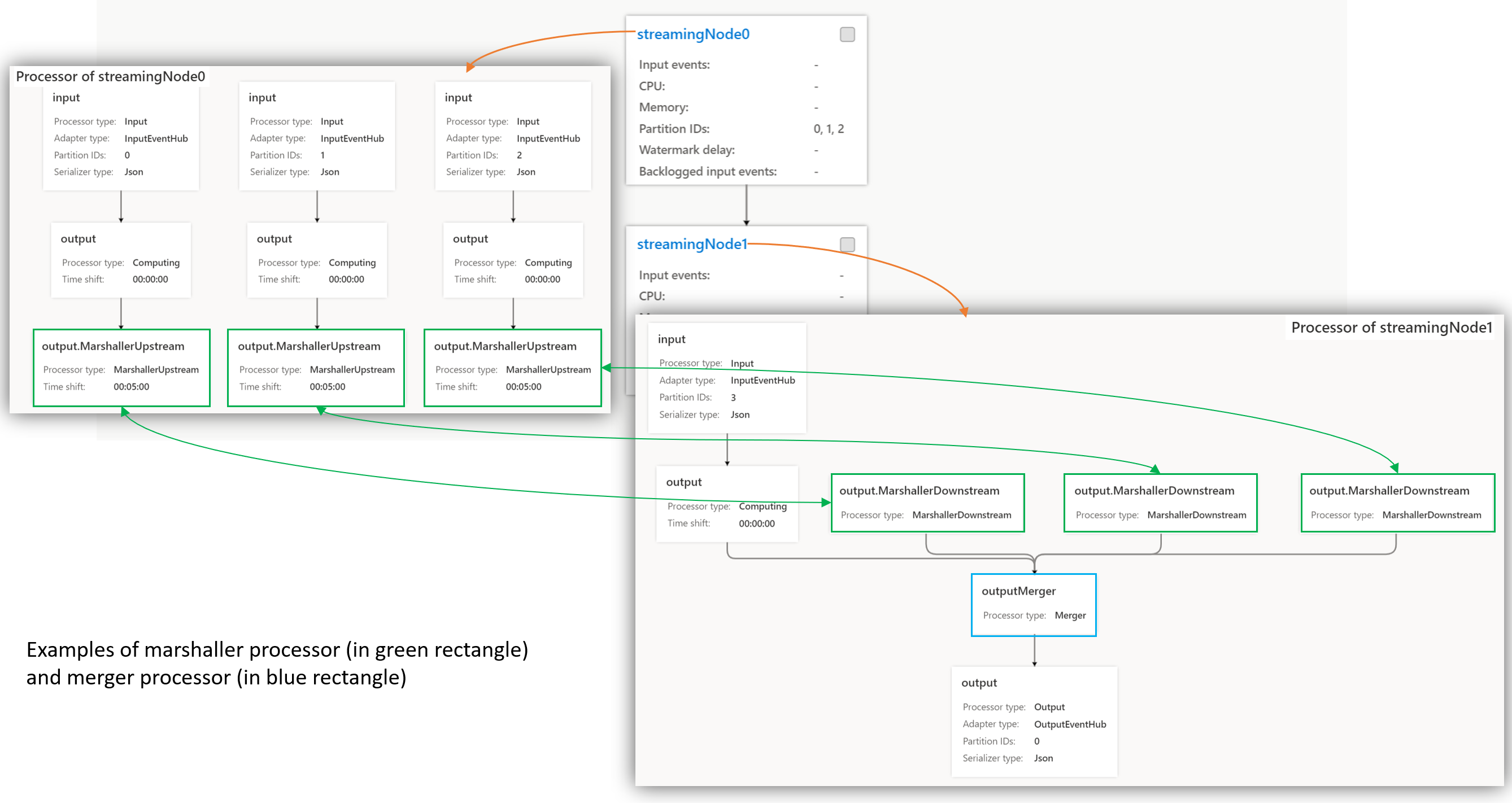
The following screenshot shows the marshaller and merger processors:
Processor types
Each processor has a type that represents a specific data processing purpose. The available processor types are:
- Input or Output: This processor reads input or writes output data streams.
- ReferenceData: This processor fetches the reference data.
- Computing: This processor processes the stream data according to the query logic, such as aggregating, filtering, and grouping with a window. To learn more about the stream data computation query functions, see Azure Stream Analytics Query Language Reference.
- MarshallerUpstream and MarshallerDownstream: When streaming nodes interact with stream data, two marshaller processors handle it. MarshallerUpstream sends the data in the upstream streaming node, and MarshallerDownstream receives the data in the downstream streaming node.
- Merger: This processor receives the crossing-partition stream data that several upstream streaming nodes output. To optimize job performance, update the query to remove the merger processor and make the job parallel, because the merger processor is the bottleneck of the job. The job diagram simulator feature within the Azure Stream Analytics extension for Visual Studio Code can help you simulate your query locally when you optimize your job query. To learn more, see Optimize query using job diagram simulator (preview).
Logical job diagram
The logical job diagram has a similar layout to the physical diagram, with three sections, but it has different metrics and configuration settings.
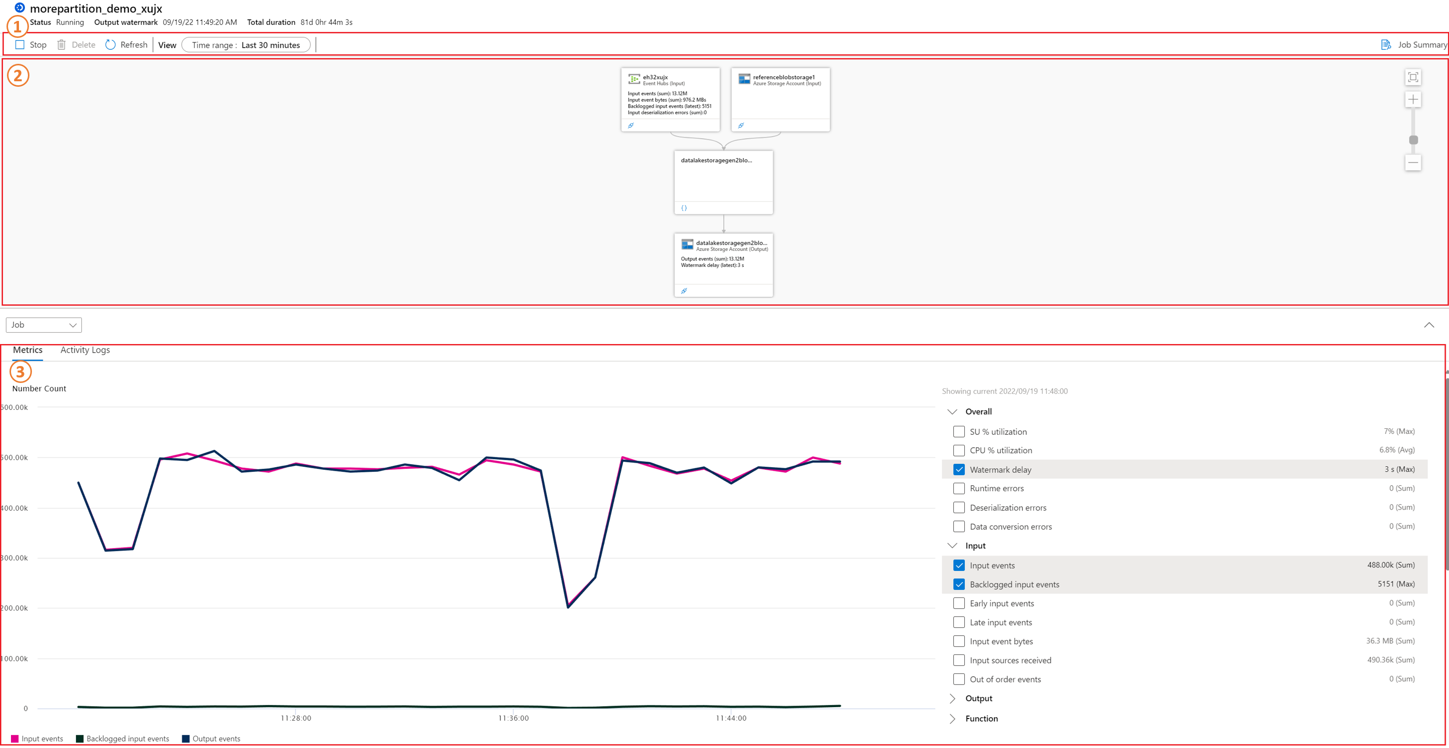
The interaction between the diagram section and the chart section is also available in the logical diagram. The node's properties filter the metrics data.
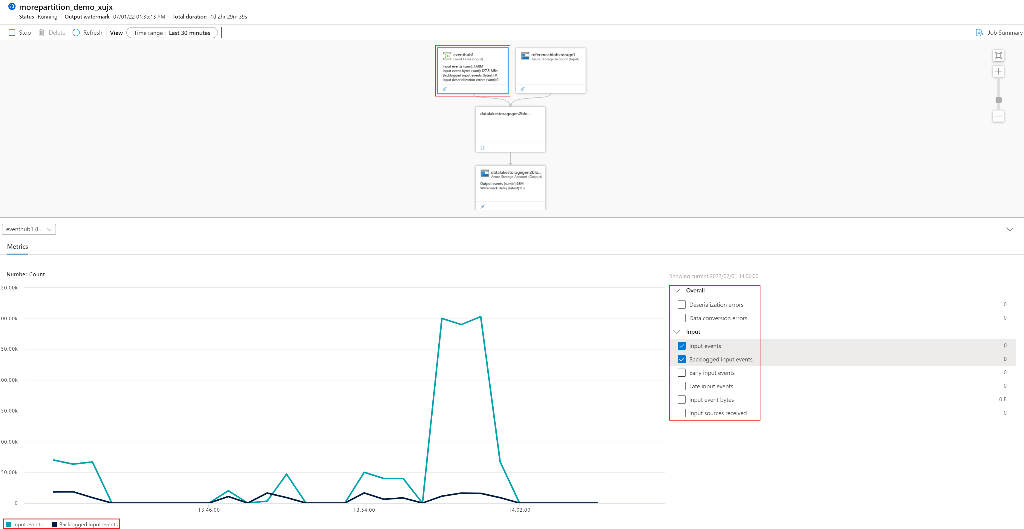
A logical job diagram has three sections: a command bar section, a diagram section, and a chart section. To learn more about how to debug with logical diagrams, see Debugging with the logical job diagram (preview) in Azure portal.
Command bar section
In the logical diagram, the command bar section provides controls to operate the cloud job (Stop, Delete) and configure the time range of the job metrics. The diagram view is only available for logical diagrams.
Diagram section
The node box in this section represents the job's input, output, and query steps. The metrics appear in the node directly, or in the chart section interactively when you select a node in this section. For more information about the metrics definition, see Azure Stream Analytics node name dimension.
Chart section
The chart section in a logical diagram has two tabs: Metrics and Activity Logs. When a logical job diagram loads, the chart section shows this job's metrics (Watermark Delay, Input Events, Output Events, and Backlogged Input Events) for the latest 30 minutes. The Metrics tab shows the job's metrics data when you select the corresponding metrics in the right panel. The Activity Logs tab shows the operations performed on jobs. When you enable the job's diagnostic log, it also appears here. To learn more about the job logs, see Azure Stream Analytics job logs.
Related content
- Debugging with the physical job diagram (preview) in Azure portal
- Debugging with the logical job diagram (preview) in Azure portal
- Introduction to Stream Analytics
- Get started with Stream Analytics
- Azure Stream Analytics job metrics
- Scale Stream Analytics jobs
- Stream Analytics query language reference
- Stream Analytics management REST API reference