Bilješka
Pristup ovoj stranici zahtijeva provjeru vjerodostojnosti. Možete pokušati da se prijavite ili promijenite direktorije.
Pristup ovoj stranici zahtijeva provjeru vjerodostojnosti. Možete pokušati promijeniti direktorije.
Time series analysis helps you understand how data behaves over time. Whether you're tracking sensor readings, monitoring system performance, or analyzing business trends, visualizing and exploring time-based data leads to better decisions. Real-Time Dashboards in Microsoft Fabric provide tools for both visual exploration and code-based analysis of time series data.
This article introduces the Time Series visualization for Real-Time Dashboards and provides an overview of Kusto Query Language (KQL) capabilities for advanced time series analysis.
Important
This feature is in preview.
When to use time series analysis
Time series analysis is useful when data changes over time and patterns matter. Common use cases include:
- IoT and equipment monitoring: Compare sensor readings against historical patterns to identify equipment drifting out of tolerance or approaching failure.
- Operational analytics: Track application response times, error rates, or throughput over time. Navigate through service tiers or geographic regions to find performance bottlenecks.
- Business trend analysis: Analyze sales, revenue, or customer engagement patterns across time periods. Compare this quarter to last quarter, or this year to the same period last year, with aligned timeframes that make seasonal patterns visible.
- Anomaly detection: Identify unexpected spikes, dips, or deviations from normal baseline patterns in your data.
Time Series visualization
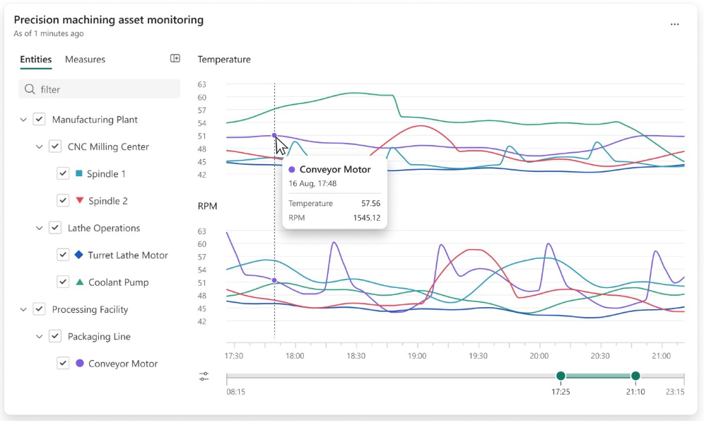
The Time Series visual in Real-Time Dashboards provides dedicated capabilities for navigating, comparing, and customizing time series data. Unlike traditional charts, this visual is designed for the unique characteristics of time-based data: trends that emerge over periods, seasonal patterns, and anomalies.
Navigate multivariate data
Time Series datasets often contain dozens or even hundreds of metrics. A single dashboard tile tracking machine performance across a factory floor might display readings from every sensor on every piece of equipment. The Time Series visual provides tools to find the data that matters:
- Legend search: Use the legend search bar to locate specific data series by name.
- Series selection: Select a series from the chart or legend, and corresponding elements highlight automatically.
- Entities panel: View your data series in a hierarchical tree structure based on your entity selections. Filter the list to find specific series, expand or collapse groups, and use checkboxes to show or hide individual series in the chart.
- Navigation tree: For datasets with logical groupings, such as sensors organized by machine or metrics organized by region, navigate through groups using the navigation tree on the right.
Adjust the timeline
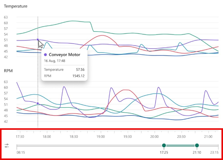
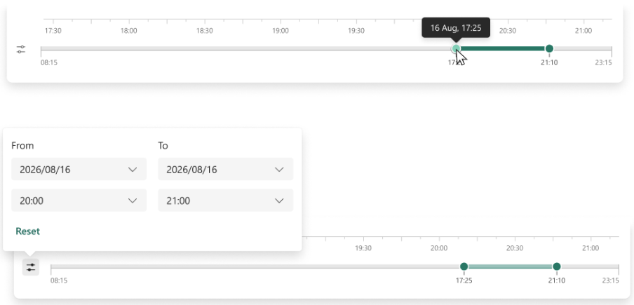
The Time Series visual renders multiple measures as separate charts, each with its own time axis and synchronized time slider. As you adjust the time range, all charts update together, keeping your analysis aligned across different metrics.
Use the time slider to:
- Drag to select a specific timeframe.
- Enter exact values to render all charts in a specific timeframe.
- Zoom in on areas of interest while maintaining context.
Customize your visual
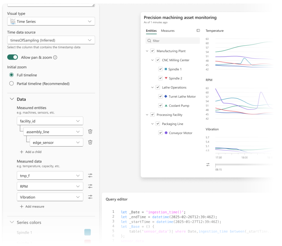
The Time Series visual editor gives you control over how you organize and display your data. In the Data section, define your Time Series structure by selecting:
- Measured entities: The dimensions that categorize your data, such as region, machine, or event type.
- Measured data: The numeric values you want to track over time.
Additional customization options include:
| Option | Description |
|---|---|
| Y-axis scaling | Choose between global, separate, or adaptive scaling with outlier removal. |
| Color assignments | Assign colors via color picker or palette. |
| Zoom controls | Zoom in and out on the data. |
| Axis scales | Switch between linear and logarithmic axis scales. |
Create a Time Series visual
Important
Ensure your data includes a timestamp column and at least one numeric value column to visualize trends over time.
To create and configure a Time Series visual in your Real-Time Dashboard:
In the top menu, select Viewing and toggle to Editing mode.
Select the Edit icon on the visual you want to customize.
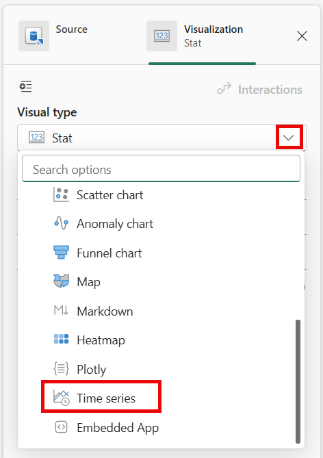
In the Visual formatting pane, open Visual type and select Time Series.
In the Data section, configure the following properties:
Time column (X-axis): Select the timestamp column that represents time intervals on the horizontal axis.
Measured data (Y-axis): Select one or more numeric fields to plot over time on the vertical axis.
Entities and Measures (optional): Select categorical fields to group your data into multiple series.
Use the Entities and Measures panel to control which data appears:
- Search for a specific series by name.
- Expand or collapse groups in the entity hierarchy.
- Select or clear checkboxes to show or hide series.
- Reorder series to control display and legend order.
This selection doesn't modify the underlying query.
Adjust the time range using the timeline controls:
- Drag the time slider to zoom in or out on specific intervals.
- Enter start and end times to define a precise range.
When multiple measures are displayed, all charts remain synchronized to the selected time range.
Customize your chart further by configuring properties such as:
Y-axis scaling:
- Global (shared scale across charts)
- Separate (independent scales per chart)
- Adaptive (reduces the impact of outliers)
Colors: Assign colors from a palette or per series.
Axis scale: Switch between linear and logarithmic scale for different data distributions.
Zoom behavior: Enable pan and zoom for interactive exploration.
Select Done to save your settings and return to the dashboard.
Advanced time series analysis with KQL
For deeper analysis beyond visual exploration, KQL provides native support for creating, processing, and analyzing time series data. By using KQL, you can:
- Create time series: Use the
make-seriesoperator to aggregate data into regular time bins, fill in missing values, and partition by dimensions. - Filter and smooth data: Apply moving averages and other filtering techniques to reduce noise and highlight trends.
- Detect trends and seasonality: Identify linear trends, trend changes, and periodic patterns in your data.
- Detect anomalies: Find outliers and unexpected deviations from baseline patterns.
- Forecast future values: Predict upcoming values by extrapolating seasonal and trend components.
For more information about KQL time series capabilities, see: