Bemærk
Adgang til denne side kræver godkendelse. Du kan prøve at logge på eller ændre mapper.
Adgang til denne side kræver godkendelse. Du kan prøve at ændre mapper.
In this tutorial, you'll create a model-driven app field component, and deploy, configure, and test the component on a form using Visual Studio Code. This code component displays a set of choices on the form with an icon next to each choice value. The component uses some of the advanced features of model-driven apps, such as choices column definitions (metadata) and column-level security.
In addition to these features, you ensure the code component follows best practice guidance:
- Use of Microsoft Fluent UI for consistency and accessibility.
- Localization of the code component labels at both design and runtime.
- Assurance that the code component is metadata-driven for better reusability.
- Assurance that the code component renders according to the form factor and available width, displaying a compact drop-down with icons where space is limited.
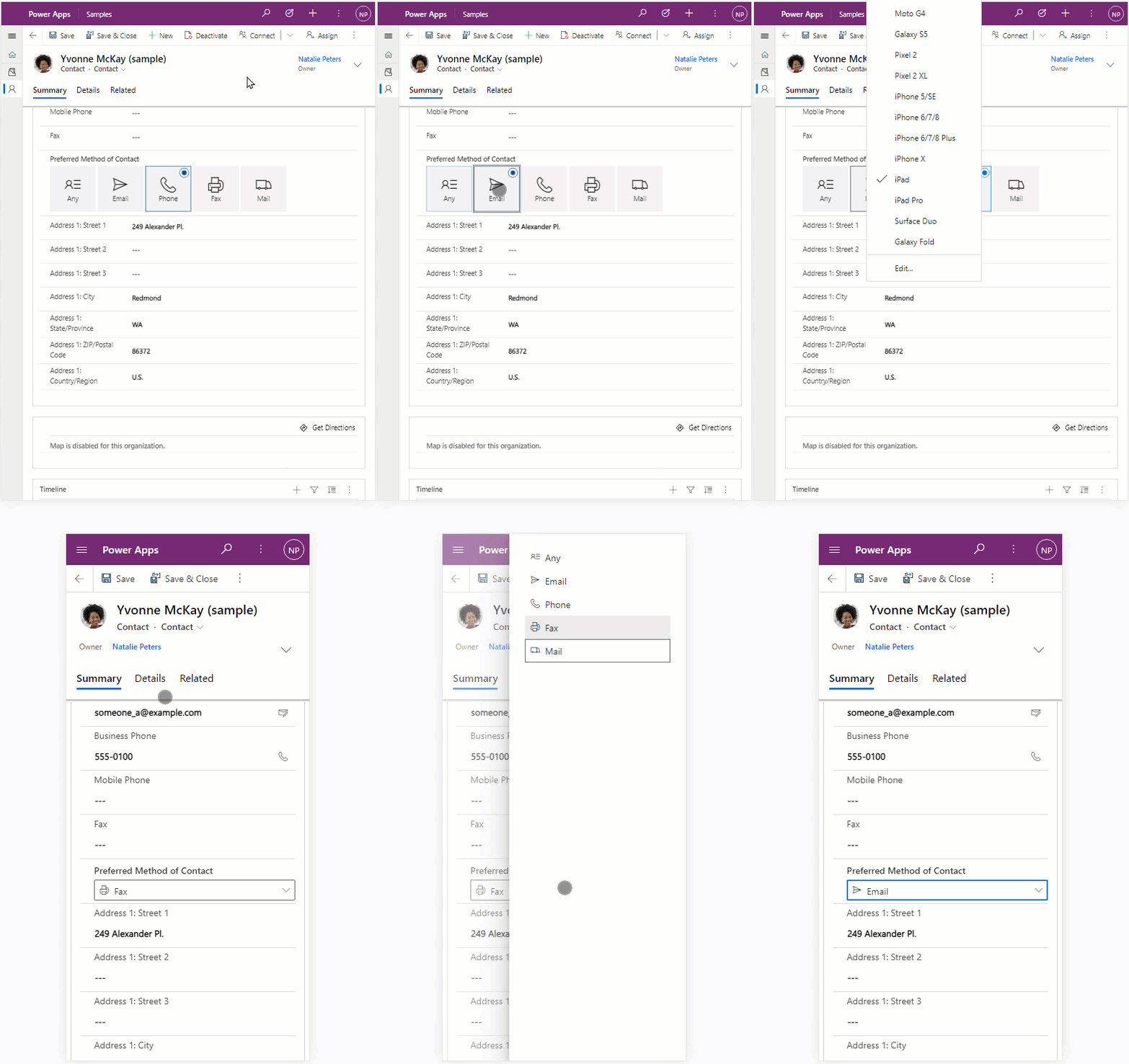
Download the ChoicesPicker sample code
You can download the complete sample from PowerApps-Samples/component-framework/ChoicesPickerControl/.
Create a new pcfproj project
Note
Before you start, make sure you install all the prerequisite components.
To create a new pcfproj project:
Create a new folder to hold your code component. For example,
C:\repos\ChoicesPicker.Open Visual Studio Code and go to File > Open Folder. Select the
ChoicesPickerfolder you created in the previous step. If you added the Windows Explorer extensions during the installation of Visual Studio Code, you can also use the Open with Code context menu option inside the folder. You can also add any folder into Visual Studio Code by usingcode .in the command prompt when the current directory is set to that location.Inside the new Visual Studio Code PowerShell terminal (Terminal > New Terminal), use the pac pcf init command to create a new code component project:
pac pcf init `
   --namespace SampleNamespace `
   --name ChoicesPicker `
   --template field `
   --run-npm-install
or use the short form:
pac pcf init -ns SampleNamespace -n ChoicesPicker -t field -npm
This step adds a new ChoicesPicker.pcfproj and related files to the current folder, including a package.json that defines the required modules. The preceding command also runs the npm install command to install the necessary modules.
Running 'npm install' for you...
Note
If you receive the error The term 'npm' is not recognized as the name of a cmdlet, function, script file, or operable program., ensure you install node.js (LTS version is recommended) and all other prerequisites.
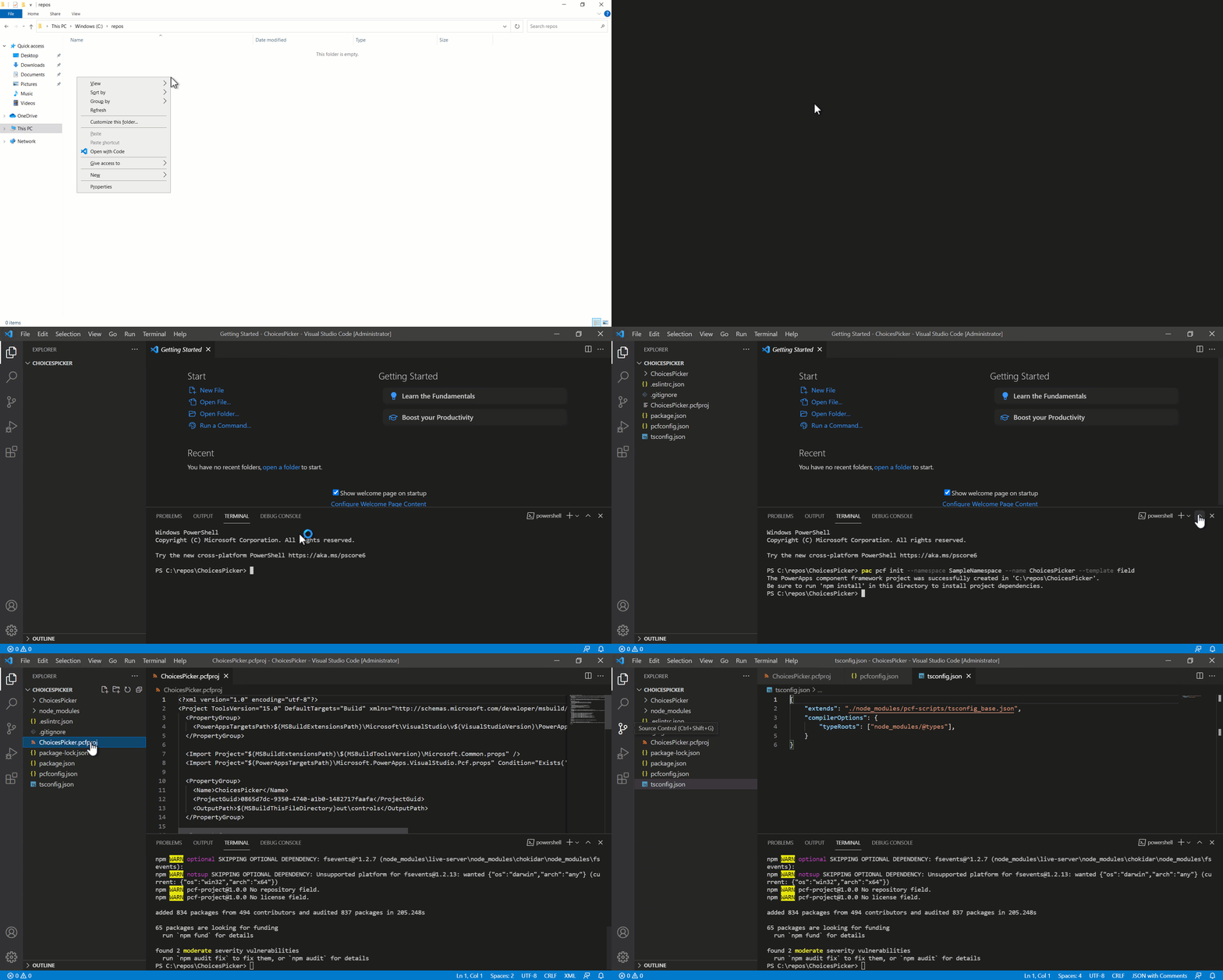
You can see that the template includes an index.ts file along with various configuration files. This file is the starting point of your code component and contains the lifecycle methods described in Component implementation.
Install Microsoft Fluent UI
Use Microsoft Fluent UI and React to create the UI, so install these dependencies. To install the dependencies, use:
npm install react react-dom @fluentui/react
This command adds the modules to the packages.json file and installs them into the node_modules folder. Don't commit node_modules to source control because you can restore all required modules later by using npm install.
One advantage of Microsoft Fluent UI is that it provides a consistent and highly accessible UI.
Configure eslint
The template used by pac pcf init installs the eslint module to your project and configures it by adding an .eslintrc.json file. You need to configure eslint for TypeScript and React coding styles. For more information, see Configure ESLint for code components.
Edit the manifest
The ChoicesPicker\ControlManifest.Input.xml file defines the metadata that describes the behavior of the code component. The control attributes already contain the namespace and name of your component.
Define the following bound and input properties:
| Name | Usage | Type | Description |
|---|---|---|---|
| Value | bound |
OptionSet | Link this property to the choice column. The code component receives the current value and then notifies the parent context when the value changes. |
| Icon Mapping | input |
Multiple lines of text | This property will have its value set when the app maker adds the code component to the form. It contains a JSON string to configure which icons can be used for each choice value. |
For more information, see property element.
Tip
You may find the XML easier to read by formatting it so that attributes appear on separate lines. Find and install an XML formatting tool of your choice in the Visual Studio Code Marketplace: Search for xml formatting extensions.
The examples below have been formatted with attributes on separate lines to make them easier to read.
Replace existing sampleProperty with new properties
Open the ChoicesPicker\ControlManifest.Input.xml and paste the following property definitions inside the control element, replacing the existing sampleProperty:
<property name="sampleProperty"
  display-name-key="Property_Display_Key"
  description-key="Property_Desc_Key"
  of-type="SingleLine.Text"
  usage="bound"
  required="true" />
Save the changes and then use the following command to build the component:
npm run build
After the component is built, you see that:
An automatically generated file
ChoicesPicker\generated\ManifestTypes.d.tsis added to your project. The build process generates this file from theControlManifest.Input.xmland provides the types for interacting with the input/output properties.The build output is added to the
outfolder. Thebundle.jsis the transpiled JavaScript that runs inside the browser. TheControlManifest.xmlis a reformatted version of theControlManifest.Input.xmlfile that's used during deployment.Note
Don't modify the contents of the
generatedandoutfolders directly. The build process overwrites them.
Implement the ChoicesPicker Fluent UI React component
When the code component uses React, the updateView method must render a single root component. Inside the ChoicesPicker folder, add a new TypeScript file named ChoicesPickerComponent.tsx, and add the following content:
import { ChoiceGroup, IChoiceGroupOption } from '@fluentui/react/lib/ChoiceGroup';
import * as React from 'react';
export interface ChoicesPickerComponentProps {
label: string;
value: number | null;
options: ComponentFramework.PropertyHelper.OptionMetadata[];
configuration: string | null;
onChange: (newValue: number | undefined) => void;
}
export const ChoicesPickerComponent = React.memo((props: ChoicesPickerComponentProps) => {
const { label, value, options, configuration, onChange } = props;
const valueKey = value != null ? value.toString() : undefined;
const items = React.useMemo(() => {
let iconMapping: Record<number, string> = {};
let configError: string | undefined;
if (configuration) {
try {
iconMapping = JSON.parse(configuration) as Record<number, string>;
} catch {
configError = `Invalid configuration: '${configuration}'`;
}
}
return {
error: configError,
choices: options.map((item) => {
return {
key: item.Value.toString(),
value: item.Value,
text: item.Label,
iconProps: { iconName: iconMapping[item.Value] },
} as IChoiceGroupOption;
}),
};
}, [options, configuration]);
const onChangeChoiceGroup = React.useCallback(
(ev?: unknown, option?: IChoiceGroupOption): void => {
onChange(option ? (option.value as number) : undefined);
},
[onChange],
);
return (
<>
{items.error}
<ChoiceGroup
label={label}
options={items.choices}
selectedKey={valueKey}
onChange={onChangeChoiceGroup}
/>
</>
);
});
ChoicesPickerComponent.displayName = 'ChoicesPickerComponent';
Note
The file has the extension tsx, a TypeScript file that supports XML style syntax used by React. The build process compiles it into standard JavaScript.
ChoicesPickerComponent design notes
This section includes comments on the design of the ChoicesPickerComponent.
It is a functional component
This is a React functional component, but equally, it could be a class component. This is based on your preferred coding style. Class components and functional components can also be mixed in the same project. Both function and class components use the tsx XML style syntax used by React. More information: Function and Class Components
Minimize bundle.js size
When importing the ChoiceGroup Fluent UI components using path-based imports, instead of:
import { ChoiceGroup, IChoiceGroupOption } from '@fluentui/react';
we use:
import { ChoiceGroup, IChoiceGroupOption } from '@fluentui/react/lib/ChoiceGroup';
This way, your bundle size will be smaller, resulting in lower capacity requirements and better runtime performance.
An alternative would be to use tree-shaking.
Description of 'props'
The input props have the following attributes that will be provided by index.ts in the updateView method.:
prop |
Description |
|---|---|
label |
Used to label the component. This is bound to the metadata field label that's provided by the parent context, using the UI language selected inside the model-driven app. |
value |
Linked to the input property defined in the manifest. This can be null when the record is new or the field is not set. TypeScript null is used rather than undefined when passing/returning property values. |
options |
When a code component is bound to a choices column in a model-driven app, the property contains the OptionMetadata that describes the choices available. You pass this to the component so it can render each item. |
configuration |
The purpose of the component is to show an icon for each choice available. The configuration is provided by the app maker when they add the code component to a form. This property accepts a JSON string that maps each numeric choice value to a Fluent UI icon name. For example, {"0":"ContactInfo","1":"Send","2":"Phone"}. |
onChange |
When the user changes the choices selection, the React component triggers the onChange event. The code component then calls the notifyOutputChanged so that the model-driven app can update the column with the new value. |
Controlled React component
There are two types of React components:
| Type | Description |
|---|---|
| Uncontrolled | Maintain their internal state and use the input props as default values only. |
| Controlled | Render the value passed by the component props. If the onChange event does not update the prop values, the user will not see a change in the UI. |
The ChoicesPickerComponent is a controlled component, so once the model-driven app has updated the value (after the notifyOutputChanged call), it calls the updateView with the new value, which is then passed to the component props, causing a re-render that displays the updated value.
Destructuring assignment
The assignment of the props constant: const { label, value, options, onChange, configuration } = props; uses destructuring assignment. In this way, you extract the attributes required to render from the props, rather than prefixing them with props each time they're used.
Use of React components and hooks
The following explains how ChoicesPickerComponent.tsx uses React components and hooks:
| Item | Explanation |
|---|---|
| React.memo | To wrap our functional component so that it won't render unless any of the input props have changed. |
| React.useMemo | To ensure that the item array created is only mutated when the input props options or configuration have changed. This is a best practice for functional components that will reduce unnecessary renders of the child components. |
| React.useCallback | To create a callback closure that's called when the Fluent UI ChoiceGroup value changes. This React hook ensures that the callback closure is only mutated when the input prop onChange is changed. This is a performance best practice similar to useMemo. |
Error behavior for Configuration input property
If parsing of the JSON configuration input property fails, the error is rendered using items.error.
Update index.ts to render the ChoicesPicker component
You need to update the generated index.ts file to render the ChoicesPickerComponent.
When you use React inside a code component, the updateView method renders the root component. You pass all the values needed to render the component into the component. When these values change, the component re-renders.
Add import statements and initialize icons
Before you can use the ChoicesPickerComponent component in the index.ts file, add the following code at the top of the file:
Note
You must import initializeIcons because you're using the Fluent UI icon set. Call initializeIcons to load the icons inside the test harness. Inside model-driven apps, the icons are already initialized.
Add attributes to ChoicesPicker class
The code component maintains its instance state by using attributes. This state is different from React component state. Inside the index.ts file, add the following attributes to the ChoicesPicker class:
export class ChoicesPicker implements ComponentFramework.StandardControl<IInputs, IOutputs> {
The following table explains these attributes:
| Attribute | Description |
|---|---|
notifyOutputChanged |
Holds a reference to the method used to notify the model-driven app that a user changed a choice value and the code component is ready to pass it back to the parent context. |
rootContainer |
HTML DOM element that's created to hold the code component inside the model-driven app. |
selectedValue |
Holds the state of the choice selected by the user so that it can be returned inside the getOutputs method. |
context |
Power Apps component framework context that's used to read the properties defined in the manifest and other runtime properties, and access API methods such as trackContainerResize. |
Update the init method
To set these attributes, update the init method.
public init(
context: ComponentFramework.Context<IInputs>,
notifyOutputChanged: () => void,
state: ComponentFramework.Dictionary,
container: HTMLDivElement):
void {
// Add control initialization code
}
The init method is called when the code component initializes on an app screen.
Add the onChange method
When the user changes the selected value, call notifyOutputChanged from the onChange event.
Add a function:
onChange = (newValue: number | undefined): void => {
this.selectedValue = newValue;
this.notifyOutputChanged();
};
Update the getOutputs method
Tip
If you wrote client API scripts before in model-driven apps, you might be used to using the form context to update attribute values. Code components should never access this context. Instead, rely on notifyOutputChanged and getOutputs to provide one or more changed values. You don't need to return all bound properties defined in the IOutput interface, only the ones that changed their value.
Update the updateView method
Update the updateView method to render the ChoicesPickerComponent:
public updateView(context: ComponentFramework.Context<IInputs>): void {
// Add code to update control view
}
You pull the label and options from context.parameters.value. The value.raw provides the numeric choice selected or null if no value is selected.
Edit the destroy function
Clean up resources when the code component is destroyed:
For more information, see ReactDOM.unmountComponentAtNode.
Start the test harness
Ensure you save all the files. At the terminal, use:
npm start watch
You see that the test harness starts with the choices picker rendered inside a new browser window. Initially, it shows an error because the string property configuration has the default value val. Set the configuration so that it maps the test harness default choices 0, 1, and 2 with the following Fluent UI icons:
{"0":"ContactInfo","1":"Send","2":"Phone"}
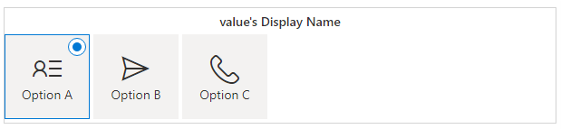
When you change the option selected, you see the value in the Data Inputs panel on the right. If you change the value, the component shows the associated value updated.
Support read-only and column-level security
When you create model-driven apps field components, your applications need to respect the control state when it's read-only or masked due to column-level security. If the code component doesn't render a read-only UI when the column is read-only, in some circumstances (for example, when a record is inactive) a column can be updated by the user where it shouldn't be. For more information, see Column-level security to control access.
Edit the updateView method for read-only and column-level security
In index.ts, edit the updateView method to add the following code to get the disabled and masked flags:
public updateView(context: ComponentFramework.Context<IInputs>): void {
const { value, configuration } = context.parameters;
if (value && value.attributes && configuration) {
ReactDOM.render(
React.createElement(ChoicesPickerComponent, {
label: value.attributes.DisplayName,
options: value.attributes.Options,
configuration: configuration.raw,
value: value.raw,
onChange: this.onChange,
}),
this.rootContainer,
);
}
}
The value.security property is available only in a model-driven app when column-level security configuration is applied to the bound column.
Pass these values into the React component through its props.
Edit ChoicesPickerComponent to add the disabled and masked properties
In ChoicesPickerComponent.tsx, accept the disabled and masked properties by adding them to the ChoicesPickerComponentProps interface:
export interface ChoicesPickerComponentProps {
label: string;
value: number | null;
options: ComponentFramework.PropertyHelper.OptionMetadata[];
configuration: string | null;
onChange: (newValue: number | undefined) => void;
}
Edit ChoicesPickerComponent props
Add the new attributes to the props.
export const ChoicesPickerComponent = React.memo((props: ChoicesPickerComponentProps) => {
const { label, value, options, configuration, onChange } = props;
Edit ChoicesPickerComponent return node
Inside the ChoicesPickerComponent, when returning the React nodes, use these new input props to ensure that the picker is disabled or masked.
return (
<>
{items.error}
<ChoiceGroup
label={label}
options={items.choices}
selectedKey={valueKey}
onChange={onChangeChoiceGroup}
/>
</>
);
Note
You shouldn't see any difference in the test harness because it can't simulate read-only fields or column-level security. You need to test this feature after deploying the control within a model-driven application.
Make the code component responsive
Code components can render on web, tablet, and mobile apps. Consider the space available. Make the choices component render as a drop-down when the available width is restricted.
Import the Dropdown component and icons
In ChoicesPickerComponent.tsx, the component renders the small version by using the Fluent UI Dropdown component, so you add it to the imports:
import { ChoiceGroup, IChoiceGroupOption } from '@fluentui/react/lib/ChoiceGroup';
import * as React from 'react';
Add formFactor prop
Update the code component to render differently depending on a new prop formFactor. Add the following attribute to the ChoicesPickerComponentProps interface:
export interface ChoicesPickerComponentProps {
label: string;
value: number | null;
options: ComponentFramework.PropertyHelper.OptionMetadata[];
configuration: string | null;
onChange: (newValue: number | undefined) => void;
disabled: boolean;
masked: boolean;
}
Add formFactor to ChoicesPickerComponent props
Add formFactor to the props.
export const ChoicesPickerComponent = React.memo((props: ChoicesPickerComponentProps) => {
const { label, value, options, configuration, onChange, disabled, masked } = props;
Add methods and modify to support drop-down component
The drop-down component needs different rendering methods.
Add the following code above the
ChoicesPickerComponent:const iconStyles = { marginRight: '8px' }; const onRenderOption = (option?: IDropdownOption): JSX.Element => { if (option) { return ( <div> {option.data && option.data.icon && ( <Icon style={iconStyles} iconName={option.data.icon} aria-hidden="true" title={option.data.icon} /> )} <span>{option.text}</span> </div> ); } return <></>; }; const onRenderTitle = (options?: IDropdownOption[]): JSX.Element => { if (options) { return onRenderOption(options[0]); } return <></>; };These methods let the
Dropdownrender the correct icon next to the drop-down value.Add a new
onChangeDropDownmethod.Add an
onChangemethod for theDropdownthat's similar to theChoiceGroupevent handler. Add the newDropdownversion just after the existingonChangeChoiceGroupmethod:const onChangeDropDown = React.useCallback( (ev: unknown, option?: IDropdownOption): void => { onChange(option ? (option.data.value as number) : undefined); }, [onChange], );
Change the rendered output
Make the following changes to use the new formFactor property.
return (
<>
{items.error}
{masked && '****'}
{!items.error && !masked && (
<ChoiceGroup
label={label}
options={items.choices}
selectedKey={valueKey}
disabled={disabled}
onChange={onChangeChoiceGroup}
/>
)}
</>
);
You output the ChoiceGroup component when formFactor is large, and use Dropdown when it's small.
Return DropdownOptions
The last thing you need to do in ChoicesPickerComponent.tsx is to map the options metadata slightly differently to what the ChoicesGroup uses. In the items return block, under the existing choices: options.map, add the following code:
return {
error: configError,
choices: options.map((item) => {
return {
key: item.Value.toString(),
value: item.Value,
text: item.Label,
iconProps: { iconName: iconMapping[item.Value] },
} as IChoiceGroupOption;
}),
};
Edit index.ts
Now that the choices component renders differently based on the formFactor prop, pass the correct value from the render call inside index.ts.
Add SmallFormFactorMaxWidth and FormFactors enum
Add the following code just before the export class ChoicesPicker class inside index.ts.
const SmallFormFactorMaxWidth = 350;
const enum FormFactors {
Unknown = 0,
Desktop = 1,
Tablet = 2,
Phone = 3,
}
The SmallFormFactorMaxWidth is the width when the component starts to render using the Dropdown rather than ChoiceGroup component. The FormFactors enum is used for convenience when calling context.client.getFormFactor.
Add code to detect formFactor
Add the following code to the React.createElement props underneath the existing props:
React.createElement(ChoicesPickerComponent, {
label: value.attributes.DisplayName,
options: value.attributes.Options,
configuration: configuration.raw,
value: value.raw,
onChange: this.onChange,
disabled: disabled,
masked: masked,
}),
Request updates for resize
Since you're using context.mode.allocatedWidth, you need to let the model-driven app know that you want to receive updates (via a call to updateView) when the available width changes. Add a call to context.mode.trackContainerResize inside the init method:
public init(
context: ComponentFramework.Context<IInputs>,
notifyOutputChanged: () => void,
state: ComponentFramework.Dictionary,
container: HTMLDivElement):
void {
this.notifyOutputChanged = notifyOutputChanged;
this.rootContainer = container;
this.context = context;
}
Try in the test harness
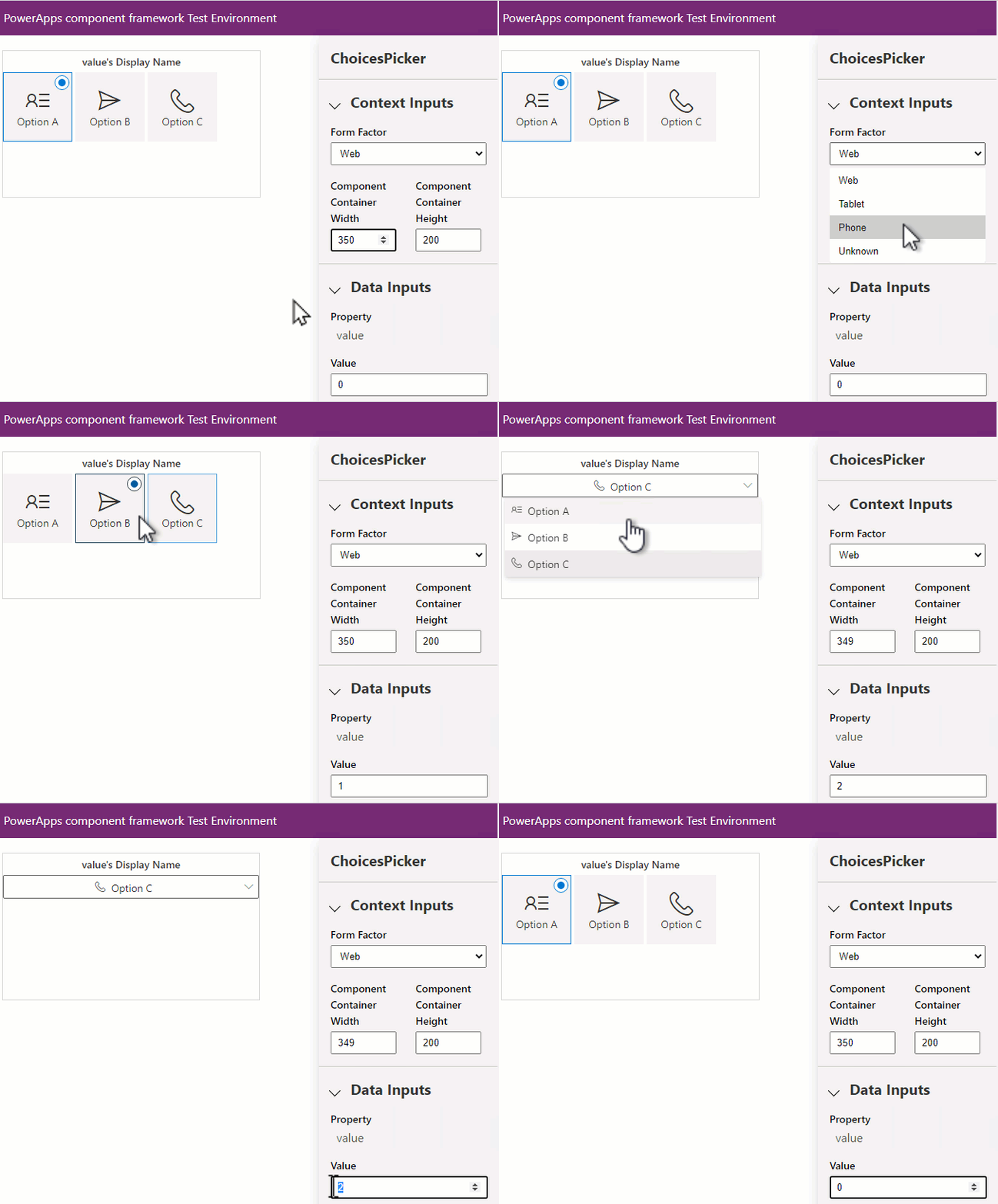
Save all the changes so the test harness browser window automatically reflects them. Keep npm start watch running from earlier. Switch the value of Component Container Width between 349 and 350 and see the rendering behave differently. Swap the Form Factor between Web and Phone and see the same behavior.
Localization
To support multiple languages, your code component can include a resource file that provides translations for both design and runtime strings.
Add a new file at the location
ChoicesPicker\strings\ChoicesPicker.1033.resx. To add labels for a different locale, change the 1033 (en-us) to the locale of your choice.Using the Visual Studio Code resource editor, enter the following values:
Name Value ChoicesPicker_NameChoices Picker (Model Driven) ChoicesPicker_DescShows choices as a picker with icons Value_NameValue Value_DescThe choices field to bind the control to Configuration_NameIcon Mapping Configuration Configuration_DescConfiguration that maps the choice value to a fluent ui icon. E.g. {"1":"ContactInfo","2":"Send"} Otherwise, set the content of the .resx file with the following XML:
<?xml version="1.0" encoding="utf-8"?> <root> <xsd:schema id="root" xmlns="" xmlns:xsd="http://www.w3.org/2001/XMLSchema" xmlns:msdata="urn:schemas-microsoft-com:xml-msdata"> <xsd:import namespace="http://www.w3.org/XML/1998/namespace"/> <xsd:element name="root" msdata:IsDataSet="true"> <xsd:complexType> <xsd:choice maxOccurs="unbounded"> <xsd:element name="metadata"> <xsd:complexType> <xsd:sequence> <xsd:element name="value" type="xsd:string" minOccurs="0"/> </xsd:sequence> <xsd:attribute name="name" use="required" type="xsd:string"/> <xsd:attribute name="type" type="xsd:string"/> <xsd:attribute name="mimetype" type="xsd:string"/> <xsd:attribute ref="xml:space"/> </xsd:complexType> </xsd:element> <xsd:element name="assembly"> <xsd:complexType> <xsd:attribute name="alias" type="xsd:string"/> <xsd:attribute name="name" type="xsd:string"/> </xsd:complexType> </xsd:element> <xsd:element name="data"> <xsd:complexType> <xsd:sequence> <xsd:element name="value" type="xsd:string" minOccurs="0" msdata:Ordinal="1"/> <xsd:element name="comment" type="xsd:string" minOccurs="0" msdata:Ordinal="2"/> </xsd:sequence> <xsd:attribute name="name" type="xsd:string" use="required" msdata:Ordinal="1"/> <xsd:attribute name="type" type="xsd:string" msdata:Ordinal="3"/> <xsd:attribute name="mimetype" type="xsd:string" msdata:Ordinal="4"/> <xsd:attribute ref="xml:space"/> </xsd:complexType> </xsd:element> <xsd:element name="resheader"> <xsd:complexType> <xsd:sequence> <xsd:element name="value" type="xsd:string" minOccurs="0" msdata:Ordinal="1"/> </xsd:sequence> <xsd:attribute name="name" type="xsd:string" use="required"/> </xsd:complexType> </xsd:element> </xsd:choice> </xsd:complexType> </xsd:element> </xsd:schema> <resheader name="resmimetype"> <value>text/microsoft-resx</value> </resheader> <resheader name="version"> <value>2.0</value> </resheader> <resheader name="reader"> <value>System.Resources.ResXResourceReader, System.Windows.Forms, Version=4.0.0.0, Culture=neutral, PublicKeyToken=b77a5c561934e089</value> </resheader> <resheader name="writer"> <value>System.Resources.ResXResourceWriter, System.Windows.Forms, Version=4.0.0.0, Culture=neutral, PublicKeyToken=b77a5c561934e089</value> </resheader> <data name="ChoicesPicker_Name" xml:space="preserve"> <value>Choices Picker (Model Driven)</value> <comment/> </data> <data name="ChoicesPicker_Desc" xml:space="preserve"> <value>Shows choices as a picker with icons</value> <comment/> </data> <data name="Value_Name" xml:space="preserve"> <value>Value</value> <comment/> </data> <data name="Value_Desc" xml:space="preserve"> <value>The choices field to bind the control to</value> <comment/> </data> <data name="Configuration_Name" xml:space="preserve"> <value>Icon Mapping Configuration</value> <comment/> </data> <data name="Configuration_Desc" xml:space="preserve"> <value>Configuration that maps the choice value to a fluent ui icon. E.g. {"1":"ContactInfo","2":"Send"}</value> <comment/> </data> </root>Tip
Don't edit
resxfiles directly. The Visual Studio Code resource editor or an extension for Visual Studio Code makes this task easier.
Update the manifest for resource strings
After you create the resource strings, update the ControlManifest.Input.xml to reference them.
<?xml version="1.0" encoding="utf-8" ?>
<manifest>
<control namespace="SampleNamespace"
constructor="ChoicesPicker"
version="0.0.1"
display-name-key="ChoicesPicker"
description-key="ChoicesPicker description"
control-type="standard">
<external-service-usage enabled="false">
</external-service-usage>
<property name="value"
  display-name-key="Value"
  description-key="Value of the Choices Control"
  of-type="OptionSet"
  usage="bound"
  required="true"/>
<property name="configuration"
  display-name-key="Icon Mapping"
  description-key="Configuration that maps the choice value to a fluent ui icon."
  of-type="Multiple"
  usage="input"
  required="true"/>
<resources>
<code path="index.ts"
order="1"/>
</resources>
</control>
</manifest>
You can see that:
- The
display-name-keyanddescription-keyvalues now point to the corresponding key in theresxfile. - There's an additional entry in the
resourceselement indicating that the code component should load resources from the referenced file.
If you need any more strings for use in your component, add them to the resx file and then load the strings at runtime by using getString. For more information, see Implementing localization API component.
Note
One limitation of the test harness is that it doesn't load resource files. To fully test your component, you need to deploy the component to Microsoft Dataverse.
Deploy and configure in a model-driven app
After testing basic functionality with the test harness, deploy the component to Microsoft Dataverse so you can fully test the code component end-to-end inside a model-driven app.
Inside your Dataverse environment, ensure there's a publisher created with a prefix of
samples: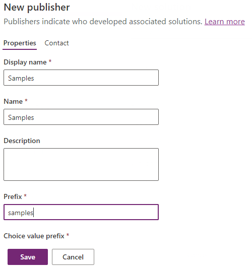
You can also use your own publisher, as long as you update the publisher prefix parameter in the call to pac pcf push accordingly.
For more information, see Create a solution publisher.
After you save the publisher, authorize the Microsoft Power Platform CLI against your environment so you can push the compiled code component. At the command line, use:
pac auth create --url https://myorg.crm.dynamics.comReplace
myorg.crm.dynamics.comwith the URL of your Dataverse environment. Sign in by using a system administrator or customizer privileges when prompted. These roles provide the privileges needed to deploy any code components to Dataverse.To deploy your code component, use:
pac pcf push --publisher-prefix samplesNote
If you receive the error
Missing required tool: MSBuild.exe/dotnet.exe, addMSBuild.exe/dotnet.exein Path environment variable or useDeveloper Command Prompt for Visual Studio Code. You must install either Visual Studio 2019 for Windows & Mac or Build Tools for Visual Studio 2019. Ensure you select the.NET build toolsworkload as described in the prerequisites.When the process finishes, it creates a temporary solution named PowerAppTools_samples in your environment. The
ChoicesPickercode component is added to this solution. You can move the code component into your solution later if necessary. For more information, see Code Component Application Lifecycle Management (ALM).

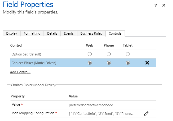
Next, add the code component to the Contacts form by going to Main Form in the Classic Editor, selecting Preferred Method of Contact > Change Properties > Controls Tab > Add Control > Select Choices Picker > Add.
Note
In the future, you won't need the classic editor to configure code components on model-driven apps forms.
Set the following properties on the component:
Set the Choices Picker as the default for web, phone, and tablet.
Enter the following string for the Icon Mapping Configuration by selecting the edit icon and selecting Bind to a static value.
{
    "1":"ContactInfo",
    "2":"Send",
    "3":"Phone",
    "4":"Fax",
    "5":"DeliveryTruck"
}
These Fluent UI icons are used for each choice value.
Select the Display tab and uncheck Display label on the form since you show the label above the choices picker.
Save and Publish the form.
Open a contact record inside the model-driven app with the correct form selected. You see the
ChoicesPickercode component instead of the standard drop-down control. (You might need to do a hard reload of the page for the component to show up).Note
You might see that text alignment is slightly different in the test harness compared to model-driven apps. This difference occurs because the test harness has different CSS rules than model-driven apps. For this reason, always fully test your code component after deployment.
Debug after deployment to Dataverse
If you need to make further changes to your component, you don't need to deploy each time. Instead, use the technique described in Debug code components to create a Fiddler AutoResponder to load the file from your local file system while npm start watch is running.
Note
You might not need to debug after deployment to Dataverse if you can test all functionality by using the test harness. However, always deploy and test inside Dataverse before distributing your code component.
The AutoResponder looks similar to the following:
REGEX:(.*?)((?'folder'css|html)(%252f|\/))?SampleNamespace\.ChoicesPicker[\.\/](?'fname'[^?]*\.*)(.*?)$
C:\repos\ChoicesPicker\out\controls\ChoicesPicker\${folder}\${fname}
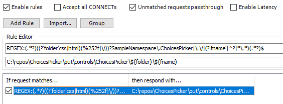
You need to Empty cache and hard refresh on your browser session for the AutoResponder file to be picked up. Once loaded, you can refresh the browser since Fiddler adds a cache-control header to the file to prevent it from being cached.
When you're done with your changes, you can increment the patch version in the manifest and then redeploy by using pac pcf push.
So far, you deployed a development build that's not optimized and runs slower at runtime. You can choose to deploy an optimized build by using pac pcf push after editing the ChoicesPicker.pcfproj file. Under the OutputPath, add the following:
<PcfBuildMode>production</PcfBuildMode>
Related articles
Application lifecycle management (ALM) with Microsoft Power Platform
Power Apps component framework API reference
Create your first component
Debug code components